🌈✨Calling all agribusinesses on Instagram! Master the design essentials and elevate your Instagram grid! Have you ever thought about the way different colours make people feel? Here are our top three tips to leverage the power of colour to your advantage:
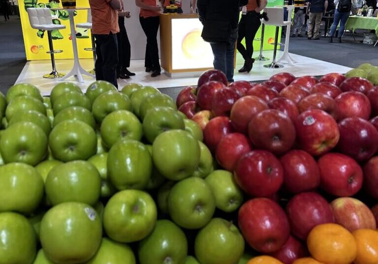
1️⃣Colour psychology: Think about how different colours make you feel. For example, red is often associated with powerful emotions (think “attention” or “stop” while green is synonymous with “go” and even health as it relates to both humans and the world we live in. By strategically incorporating colour psychology correctly you can heavily influence the way your audience perceives and engages with your content.
2️⃣Contrast is key: Make elements pop with colour combinations. Assess your colour wheel and choose opposite colours for the best contrast. A well thought out contrast not only adds visual interest but also directs attention where it matters most.
3️⃣Brand personality: Infuse your design with colours that resonate with your brand’s identity. Think about how you would like your brand to feel and associate this with the appropriate colours. Whether it’s a bold and powerful statement for a professional or a sophisticated vibe, let your colour palette align with your brand personality.
🎨Remember everyone views colours differently but by understanding general colour associations, you can give your content a confident boost making it more appealing to your agri-rural audience.
#WrightSocial #SocialMediaMarketing #SocialMediaManagement #InstagramForAgribusiness #ColourTheory


Leave a Reply